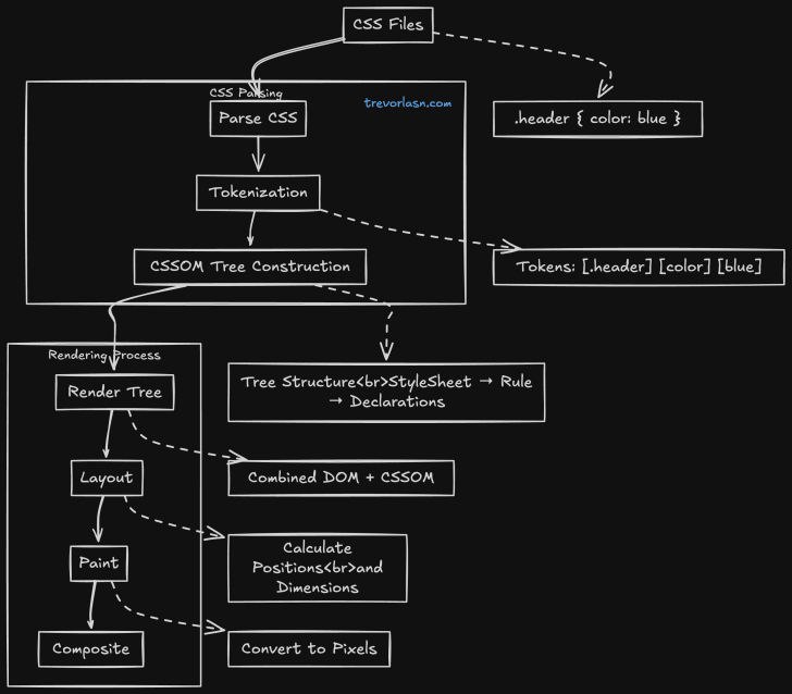
Every browser has a rendering engine with two critical components: the DOM (Document Object Model) and CSSOM (CSS Object Model).
While DOM handles the structure and content of your webpage, CSSOM processes and manages all styling information. Think of it this way: if DOM tells browsers what elements exist on your page, CSSOM tells them how these elements should look and behave visually. The CSSOM is your browser’s complete map of every style rule, property, and value that could affect your page’s appearance.
When your browser loads a webpage, it follows a strict rendering pipeline. First, it parses HTML to build the DOM, then parses CSS to build the CSSOM. These two trees combine to create the render tree, which the browser uses to calculate layouts and positions before finally painting pixels to the screen.
CSSOM isn’t just a static collection of styles - it’s an active system that continuously tracks all style rules and their relationships, calculates computed styles for elements, handles style inheritance and cascading, manages dynamic style updates, and enables JavaScript to manipulate styles programmatically.
Understanding CSSOM is crucial because it directly impacts how efficiently your browser can process and apply styles, especially in dynamic web applications.
What Exactly is CSSOM?
Think of CSSOM (CSS Object Model) as DOM’s lesser-known sibling. While DOM represents your HTML as a tree of objects, CSSOM does the same for your CSS. But there’s more to it than just being a data structure.
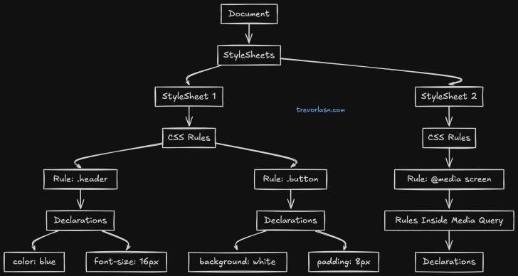
The diagram above shows how CSSOM organizes your styles into a tree structure. At the root sits your document, which holds all your stylesheets. Each stylesheet, whether it’s loaded from an external file or written inline, contains a collection of CSS rules. These rules then branch out into individual style declarations - the actual properties and values that define how your elements look.
This tree structure isn’t just for organization - it’s how browsers actually process and apply your styles. When you write a CSS rule, the browser creates a corresponding node in this tree. When you modify styles through JavaScript, you’re actually traversing and manipulating this tree structure.
CSSOM processes CSS in two main steps: tokenization and parsing. Starting with a CSS rule like .header { color: blue; }, the tokenizer breaks it into distinct pieces - the selector .header, the property color, and the value blue. The parser then converts these tokens into an Abstract Syntax Tree (AST), organizing them into a structured format:
{ type: "StyleRule", selector: { type: "ClassSelector", name: "header" }, declarations: [{ property: "color", value: "blue" }]}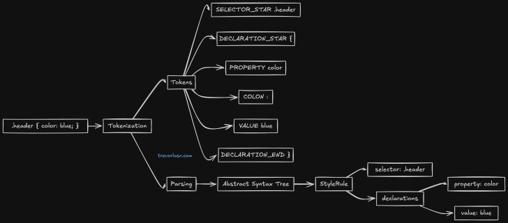
CSSOM isn’t just about storing and organizing styles. It plays a crucial role in rendering performance. Every time you change a style that could affect layout (like width or height), CSSOM needs to recalculate how this change impacts the rest of the page. This is why understanding CSSOM is crucial for building performant web applications.
The way CSSOM handles style calculations is particularly interesting. When it needs to determine the final styles for an element, it doesn’t just look at the rules directly targeting that element. It traverses up the tree, collecting inherited styles, resolving conflicts through specificity rules, and computing relative values into absolute ones. This process, known as style computation, is one of CSSOM’s most complex and performance-critical tasks.
Want to see CSSOM in action? Open your browser’s developer tools and try running document.styleSheets in the console. You’ll see the entire collection of style rules that CSSOM is managing for your current page.
Why CSSOM Matters
Remember when Internet Explorer struggled with more than 4,095 CSS selectors? That wasn’t a random limitation - it was directly related to how IE’s CSSOM implementation worked. Modern browsers are much better, but the CSSOM still impacts performance in ways many developers don’t realize.
Looking at the performance demo above, you might think “Well, a few milliseconds difference isn’t much.” But consider this: that’s just one selector.
Real-world applications often have thousands of selectors, style rules, and frequent DOM updates. Here’s where things get interesting. CSSOM isn’t just about parsing CSS once when the page loads. It comes into play every time you add or remove styles dynamically, when the viewport size changes and media queries need re-evaluation, when DOM elements are added or removed, or when classes and styles are modified.
These seemingly simple operations can trigger a cascade of CSSOM work behind the scenes. Each time you add a class to an element, the browser doesn’t just apply those new styles. It needs to recalculate whether this change affects other elements, handle any inherited properties, and potentially adjust the layout of the entire page.
Take a typical e-commerce site as an example. When a user filters products, we might add classes to show or hide items. With 100 products on the page, each with multiple style rules, what seems like a simple filter operation actually causes CSSOM to process thousands of style calculations. This is why you sometimes see a slight lag when filtering a large list of items - it’s not the JavaScript that’s slow, it’s the style recalculation.
Media Queries and CSSOM
Responsive design adds another layer of complexity to CSSOM’s work. Every time a user resizes their browser or rotates their device, CSSOM needs to check which media queries now apply, update the style tree accordingly, recalculate layouts for affected elements, and trigger repaints where needed.
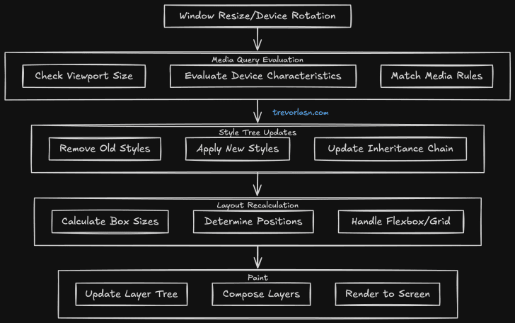
For complex layouts, this cascade of updates can cause noticeable performance issues. This is why you might see slight jank during window resizing, especially on pages with complex responsive layouts.
Future of CSSOM
The web platform continues to evolve, and CSSOM is evolving with it. CSS Houdini is giving developers direct access to the CSSOM, enabling custom layouts and paint worklets. Container Queries are changing how CSSOM handles responsive layouts, while CSS Modules affect how CSSOM manages style scoping and inheritance. The CSS Typed OM provides a more ergonomic and performant way to work with styles.
Best Practices for CSSOM Performance
Working with CSSOM effectively comes down to a few key practices. Monitor style recalculation using Chrome DevTools’ Performance panel to identify bottlenecks. Batch your style changes by using requestAnimationFrame and CSS classes instead of inline styles. Keep your selectors optimized with low specificity and avoid deep nesting. Take advantage of modern CSS features like custom properties and containment. Most importantly, profile your CSS regularly - performance audits help catch CSSOM-related issues before they become problems.